Have you ever wondered what a bitten apple and technology have in common?
The Apple logo has become one of the most iconic and world-wide known logo, but not many people know the history and the meaning behind the bitten apple.
Today, we’re going to dive into the history of the Apple logo, so you can know all about it.
And hey, it’s a cool party story to tell… that is, if you go to parties. I wouldn’t know. #quarantinelife
The first logo of the company doesn’t look at all like the actual one that represents the Apple brand.
And if you ask me, it actually gives me kind of creepy vibes.
The first logo of Apple only survived for one year before Steve Jobs asked the talented artist Rob Janoff to create something more modern and representative for Apple.
The final logo, designed by Ronald Wayne and Steve Jobs, illustrated Sir Isaac Newton under an apple tree, and for the background, it had a poem written on the side of the drawing.
The quotation by Wordsworth that was also inscribed into the logo said: “Newton… a mind forever voyaging through strange seas of thought.”
The Apple Logo: How did it become an iconic image of the company?
The iconic Apple logo, the bitten apple that we all know and love, can now be found on all the company’s products.
This apple was created by Rob Janoff in the ’70s.
According to Rob, the reason Steve Jobs wanted the apple to have a bite mark in it, was so that no one would mistake the apple for a tomato.
You can also look at the bite as a clever play on words.
Instead of spelling it B-I-T-E, you can spell it B-Y-T-E, as in the measurement for digital storage.
It is, of course, a strong reference for a tech company.
The rainbow Apple Logo
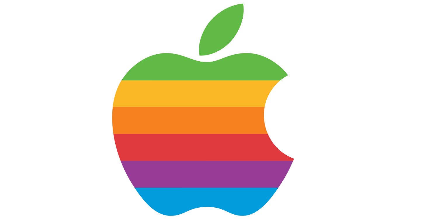
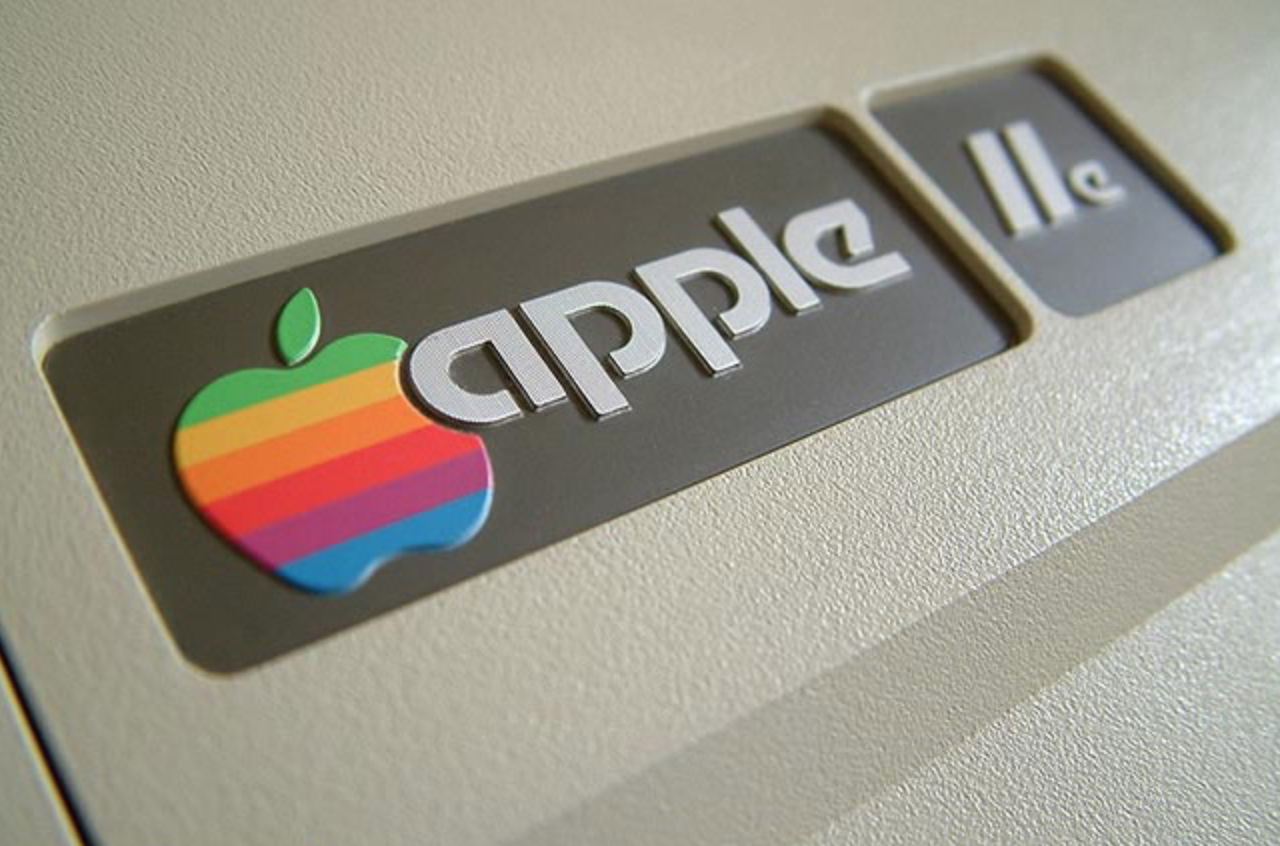
So soon after they retired good old Isaac Newton and the weird first logo, the first iconic version of the bitten apple was presented as a rainbow-striped apple.
This Apple logo represented the company between 1976 and 1998.
Rob Janoff explains why Jobs opted for the rainbow in one of his interviews.
Once the personal computer Apple II was launched, it was the first computer ever that could display colors on the screen.
A huge win for Apple and for all of humanity.
We come a long way since then, huh?
Crazy to think that it wasn’t even that long ago that we didn’t have computers that displayed colors!
The representatives of the company wanted to make this fact known by all, thus was born the rainbow apple.
Also, the colors were also an attempt to make the logo more accessible and to attract the young generation.
Here is Apple II in all of her spectacular glory.
In 1998, things started to change again, which means that the Apple logo went through a change as well.
As should all companies after a while!
Steve Jobs decided to change the rainbow apple into a monochromatic apple.
A great, modern move on their part.
Apple always seems to be in the lead.
The rainbow colors of the apple were going to go out of fashion and just wouldn’t cut it anymore.
Especially when the decided to put the logo on the back of all their products, for everyone to see.
The new monochromatic logo matched the image of the newest products on the market better than anything else.
Regarding the name of the company, there are many speculations.
Unfortunately, there isn’t one most plausible theory among all the existent ones.
Some believe that the founder’s, Steve Jobs, and Steve Wozniak, wanted their start-up to appear on the first pages of the phone books.
Others believe that they wanted to stand out of the crowd with a simple name, that was easy to be remembered by.
They wanted to create a contrast between their company and all the other hard to remember names of tech companies such as TRS-80, IBM, or Cincom.
Also, the idea that the founders wanted to bring a tribute to The Beatles’ record label.
As time went on, Apple kept simplifying their logo all the more.
Now, their logo is minimalistic and you can find it in different colors across all products; Gold, Rosegold, Silver, and Black.
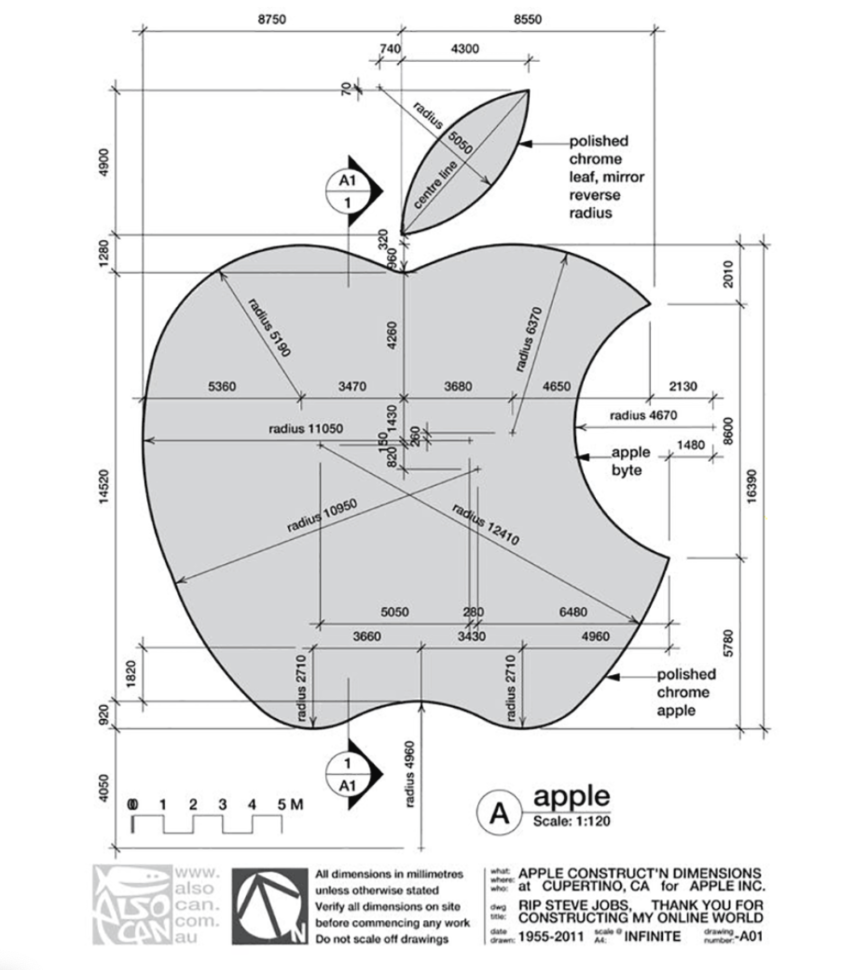
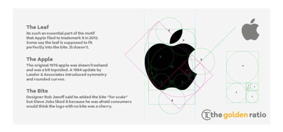
Despite the color changes that we’ve been seeing since the ’70s, the apple has and probably will remain intact from here on out.
The iconic apple is here to stay, with just a few modifications here and there every few years.
What do you guys think of Apple’s logo?
If you were in complete control of creating a new logo, would you totally revamp it? If so, then how?
Let us know in the comment section below.
Until next time,
Stay creative, folks!
Read More at The Fascinating History of the Apple Logo – 2020 Update




Post a Comment